This page looks best with JavaScript enabled

Winning probabilities in Go (leela)

· โ˜• 4 min read · โœ๏ธ Bart

photo credits: Photo by Joe Woods on Unsplash

Plotting winning probabilities in a 9x9 Go / Baduk game

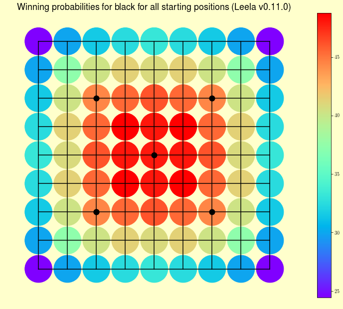
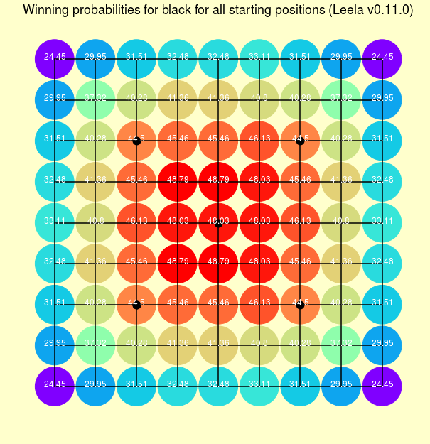
This morning I found this post on Reddit about winning probability for black for all starting positions.
I found this visualization quite interested but i couldn’t find any link to a source code to generate it or the data used to generate it, so I decided to replicate it myself.

I am starting with a 9x9, because I am not familiar with any parser to exchange data with a go engine. Next step is to make all process via a python script and been able to replicate all boards.

This quick project take me just one hour, and I am sure everything can be automated or made better, but at the end you have the data and the code, so feel free to upgrade or change anything you want.

Data

For the data I just run Leela v.0.11.0 with Chinese counting and 7.5 komi. I use the gtp engine with Sabaki an try every strating position.

Plotting considerations

I get the board from this question in stackoverflow, I simply add star points and different configurations (one for plotting with color bar and other with numbers or without them.

 1
 2
 3
 4
 5
 6
 7
 8
 9
10
11
12
13
14
15
16
17
18
19
20
21
22
23
24
25
26
27
28
29
30
# with colorbar
#fig = plt.figure(figsize=[13,10.5])
# with numbers
fig = plt.figure(figsize=[8,8])

fig.patch.set_facecolor((1,1,.8))

ax = fig.add_subplot(111)

# draw the grid
for x in range(9):
    ax.plot([x, x], [0,8], 'k')
for y in range(9):
    ax.plot([0, 8], [y,y], 'k')

# scale the axis area to fill the whole figure
ax.set_position([0,0,1,1])

# get rid of axes and everything (the figure background will show through)
ax.set_axis_off()

# scale the plot area conveniently (the board is in 0,0..18,18)
ax.set_xlim(-1,9)
ax.set_ylim(-1,9)

# draw star points
s1, = ax.plot([2,6,6,2,2,4],[2,2,6,2,6,4],'o',
	     markersize=10, markeredgecolor=(0,0,0), 
             markerfacecolor='k', markeredgewidth=2)

Also, I think data could be better but, adding points and values like array let me easily plot every point, been able to plot labels if I want and been able to add simply the colormap.

Results

I am quite happy with the aesthetic of the results. I think these heatmaps looks better than just adding squares to every point. It is just a matter of taste! At least you have all the data and the code to make similar things or your own variations. ๐Ÿ˜„S

with colorbar
Explicit probabilities

Todo

  • Exchange (with a parser) data beetween python and go engine
  • Replicate for 13x13 and 19x19

Source code and Data

 1
 2
 3
 4
 5
 6
 7
 8
 9
10
11
12
13
14
15
16
17
18
19
20
21
22
23
24
25
26
27
28
29
30
31
32
33
34
35
36
37
38
39
40
41
42
43
44
45
46
47
48
49
50
51
52
53
54
55
56
57
58
59
60
61
62
63
64
65
66
67
68
69
70
71
72
73
74
75
76
77
78
79
80
81
82
83
84
#!/usr/bin/env python3
# -*- coding: utf-8 -*-
"""
Created on Sun Apr 26 
"""

import matplotlib.pyplot as plt
import numpy as np

# create a 8" x 8" board
# with colorbar
#fig = plt.figure(figsize=[13,10.5])
# with numbers
fig = plt.figure(figsize=[8,8])

fig.patch.set_facecolor((1,1,.8))

ax = fig.add_subplot(111)

# draw the grid
for x in range(9):
    ax.plot([x, x], [0,8], 'k')
for y in range(9):
    ax.plot([0, 8], [y,y], 'k')

# scale the axis area to fill the whole figure
ax.set_position([0,0,1,1])

# get rid of axes and everything (the figure background will show through)
ax.set_axis_off()

# scale the plot area conveniently (the board is in 0,0..18,18)
ax.set_xlim(-1,9)
ax.set_ylim(-1,9)

# draw star points
s1, = ax.plot([2,6,6,2,2,4],[2,2,6,2,6,4],'o',markersize=10, markeredgecolor=(0,0,0), markerfacecolor='k', markeredgewidth=2)

b = np.array([[ 24.45,  29.95,  31.51,  32.48,  33.11,  32.48,  31.51,  29.95,
         24.45],
       [ 29.95,  37.32,  40.28,  41.36,  40.8 ,  41.36,  40.28,  37.32,
         29.95],
       [ 31.51,  40.28,  44.5 ,  45.46,  46.13,  45.46,  44.5 ,  40.28,
         31.51],
       [ 32.48,  41.36,  45.46,  48.79,  48.03,  48.79,  45.46,  41.36,
         32.48],
       [ 32.48,  41.36,  45.46,  48.79,  48.03,  48.79,  45.46,  41.36,
         32.48],
       [ 33.11,  40.8 ,  46.13,  48.03,  48.03,  48.03,  46.13,  40.8 ,
         33.11],
       [ 31.51,  40.28,  44.5 ,  45.46,  46.13,  45.46,  44.5 ,  40.28,
         31.51],
       [ 29.95,  37.32,  40.28,  41.36,  40.8 ,  41.36,  40.28,  37.32,
         29.95],
       [ 24.45,  29.95,  31.51,  32.48,  33.11,  32.48,  31.51,  29.95,
         24.45]])

y_array = np.array([[ 0,1,2,3,4,5,6,7,8],
       [ 0,1,2,3,4,5,6,7,8],
       [ 0,1,2,3,4,5,6,7,8],
       [ 0,1,2,3,4,5,6,7,8],
       [ 0,1,2,3,4,5,6,7,8],
       [ 0,1,2,3,4,5,6,7,8],
       [ 0,1,2,3,4,5,6,7,8],
       [ 0,1,2,3,4,5,6,7,8],
       [ 0,1,2,3,4,5,6,7,8]])
    
x_array = np.array([[ 0,0,0,0,0,0,0,0,0],
       [ 1,1,1,1,1,1,1,1,1],
       [2,2,2,2,2,2,2,2,2],
       [ 3,3,3,3,3,3,3,3,3],
       [ 4,4,4,4,4,4,4,4,4],
       [ 5,5,5,5,5,5,5,5,5],
       [ 6,6,6,6,6,6,6,6,6],
       [ 7,7,7,7,7,7,7,7,7],
       [ 8,8,8,8,8,8,8,8,8]])    

#plt.colorbar()
plt.title(r'Winning probabilities for black for all starting positions (Leela v0.11.0)',fontsize=18)
s1 = ax.scatter(x_array,y_array,c=b,s=3000,cmap='rainbow')  
for i in range(0,9):
    for j in range(0,9):
        s5 = ax.text(i, j, str(b[i,j]),horizontalalignment='center', fontsize=12,color='white',fontweight='bold')
        
Share on

Bart Ortiz
WRITTEN BY
Bart
I ask myself a lot of questions.